Here at the BBER, we love good data visualization. Anytime data is shown in a way that allows the user to quickly understand the author’s purpose, we take notice! In fact, how data is visualized can be the difference between information that is clear and actionable and information that is confusing or misleading.
For that reason, we are always looking for new and innovative ways to display and visualize data. Below are some of our favorite website and resources that do just that. The list is a mix of sites, some providing hard-hitting news analysis, others focused on data viz best practices, and some just show data in clever, unique ways. If you have a favorite resource for data visualizations, share it with us!
- Five Thirty Eight is a blog that focuses on politics, economics, and sports. The blog, created by analyst Nate Silver, has become especially well-known for its detailed opinion poll analysis, which the team uses to forecast election outcomes. The site’s mission is to “advance public knowledge” using data and evidence. While the site is best known for its political analysis, we especially love it for its smart, innovative data visualizations. Check out some of the best visualizations from 2021 here.
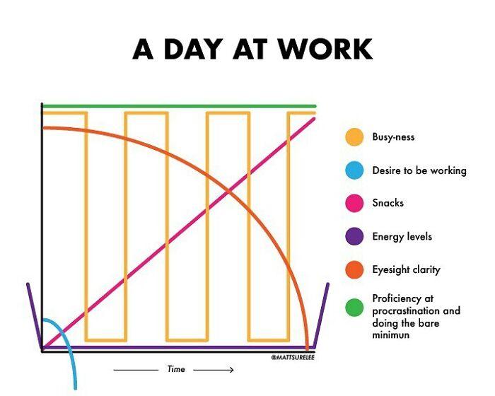
- Looking for something a little more lighthearted? In 2017, Matt Shirley began with a goal to make a chart every day. Five years later, his Instagram page has 1,827 posts and more than 420,000 followers. A recent article by Bored Panda compiles 30 of his best. We highly recommend checking it out. Some of our favorites include his visualizations on zoom calls and sunglasses, along with his perfect representation of a typical day in the office.
Image courtesy of Matt Shirley - We first discovered Visual Capitalist on LinkedIn and immediately began following their account. Since then, we have continued to be amazed by their visually stunning and informative way of sharing data. Their website states that the online publisher’s mission is to “help cut through the clutter and simplify a complex world” through data-driven storytelling and powerful visuals. Their focus is on markets, technology, energy and the global economy. We especially like their articles comparing the carbon footprint of various aspects of the economy, including the food supply chain and transportation options.
- If you want to improve your data visualization techniques, Storytelling with Data is an amazing resource. Cole Nussbaumer Knaflic has created a data visualization empire that includes a blog, three books, a podcast, videos, workshops, and an online community of practitioners. One of the things we love about her approach is that it is so accessible. Even those inexperienced with data visualization techniques can walk away with something new or flex their data viz skills with Nussbaumer’s monthly challenges or online exercises.
- For the news junkies, TheUpshot is an amazing website published by the New York Times. (A subscription is required.) The site combines conventional journalistic analysis of the news with beautiful and educational visualizations. Recent articles have focused on health outcomes in states with abortion bans, housing availability by U.S. metro area, and U.S. spending on Ukraine, among others.

