Matthew Hockert, a former BBER undergraduate research assistant, graduated in 2020. He is pursuing a Masters of Science in Applied Economics at the University of Minnesota Twin-Cities and is employed as a graduate research assistant.
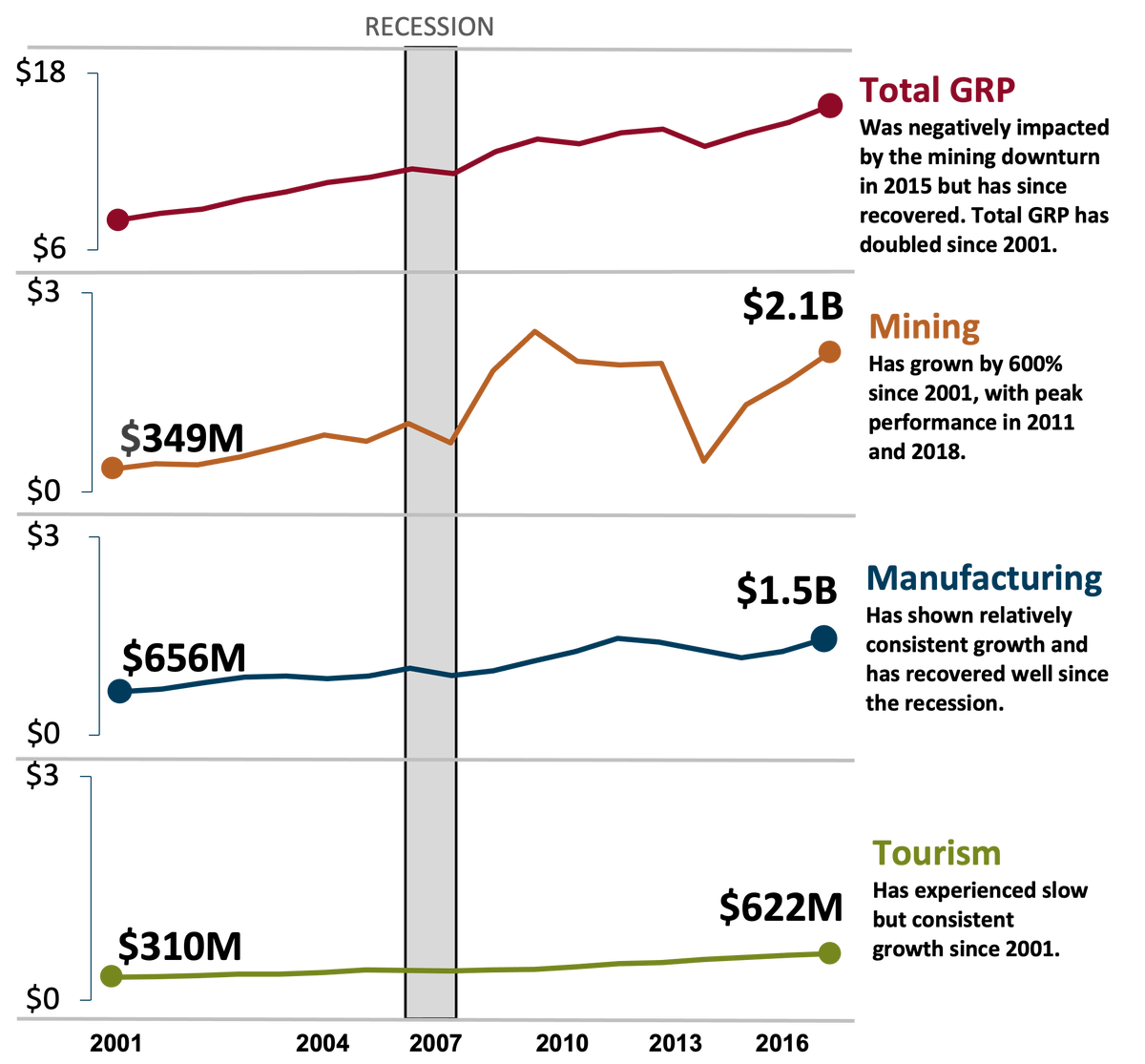
For one of the BBER's projects, I took on the task of creating a graph that could present the outputs of the total Gross Regional Product (GRP) of the Duluth Metropolitan Statistical Area, along with the mining, manufacturing, and tourism industries. As the graph below shows, the challenge was that the total GRP dominated the other industries because it had substantially larger production output compared to the other major industries. These different levels of output skewed the graph and made it difficult to understand.

The main visual in this blog shows how each industry compares to the total GRP without losing the fluctuations in each industries graph. For example, total GRP was $8.0 billion in 2001 and doubled to $16.0 billion by 2018. At the same time, production in the mining industry had grown by roughly 600% from $349 million to $2.1 billion in 2018. The growth in the mining industry during this period was not consistent either. In 2011, the mining industry had an output of roughly $2.4 billion, but it fell to $463 million in 2015. Only in the past few years has mining been able to regain output to near 2011 levels. Manufacturing and tourism have shown consistent growth trends with little fluctuations. Manufacturing has grown by 230%, and tourism doubled. Another important aspect of the graph is the 2008 recession bar. This bar is continuous across each independent graph showing how the 2008 recession affected each industry. Total GRP, mining, and manufacturing predictably fell slightly during this period, while tourism remained consistent.